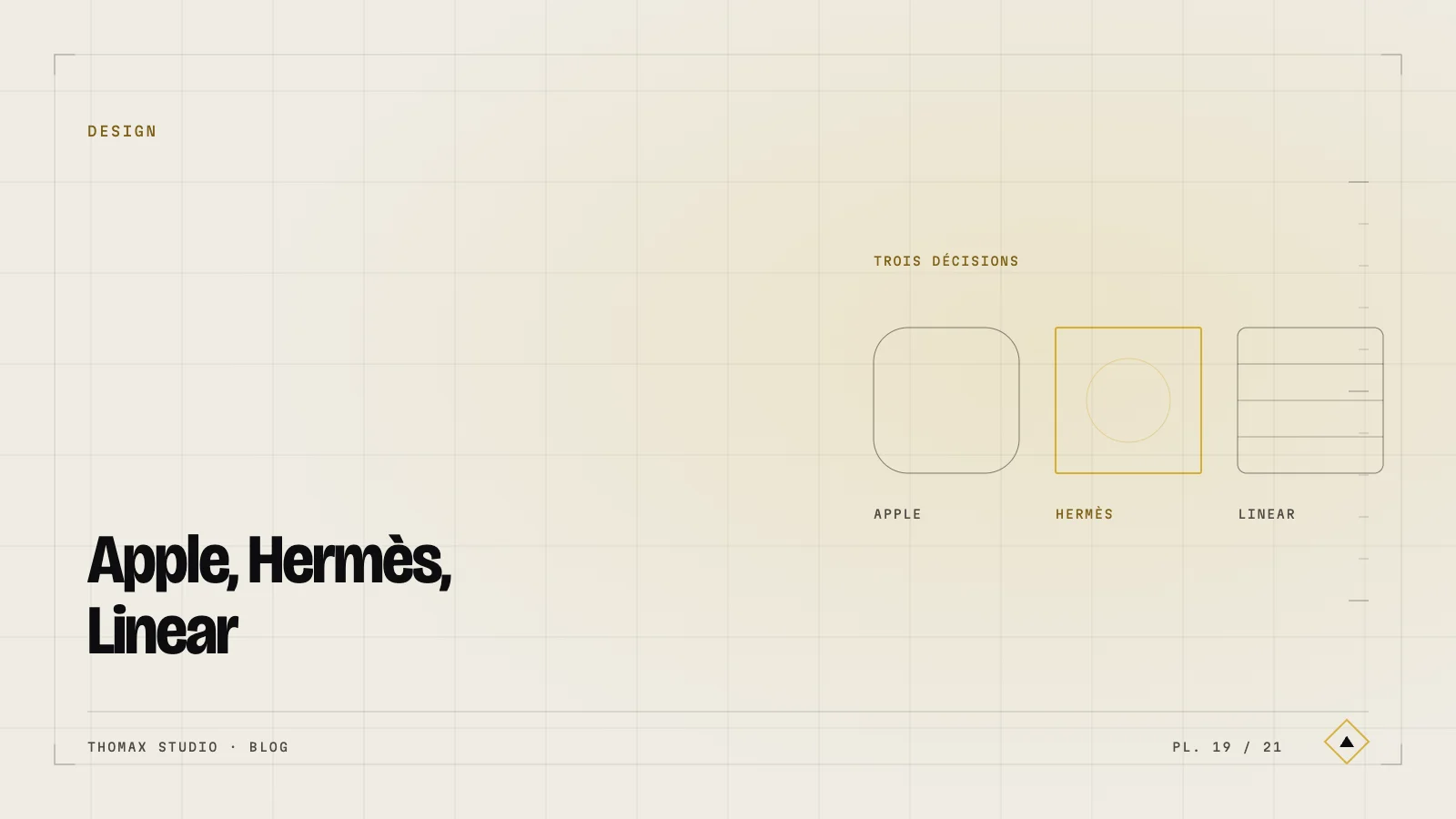
Everyone wants to “design like Apple”. Nobody can explain why Apple is Apple. Here are three concrete decisions the best brands share — and that you can adopt without copying.
Apple — the art of removal
Apple does not design by adding. It designs by removing. An Apple product page carries on average 40% fewer elements than the sector average. No promo banner. No pop-up. No excess social proof. Just the product, and the three reasons it is singular.
Worth stealing: every time you add a section, ask what you can remove so the addition can shine.
Hermès — typographic rhythm
Hermès uses a single typeface and treats it as an object. White space around it. Sharply contrasted sizes. Editorial italics on the pivotal sentences. The house never chases the image — it lets the word breathe.
Worth stealing: one strongly contrasted level of typographic hierarchy. A heading four times the body size, and nothing in between.
Linear — consistency in the detail
Linear, the project management tool, has a reputation in the industry for microscopic quality of detail. Subtle animation, refined easing, immaculate focus rings, page transitions measured to the millimetre. No detail is visible; every detail is felt.
Worth stealing: an explicit block of time for microscopic polish before every delivery. One day minimum, never sacrificed to the deadline.
What they share
None of the three follows fashion. All three have internal rules that are written down and obeyed. That is what high-end design is: not a taste, a discipline.