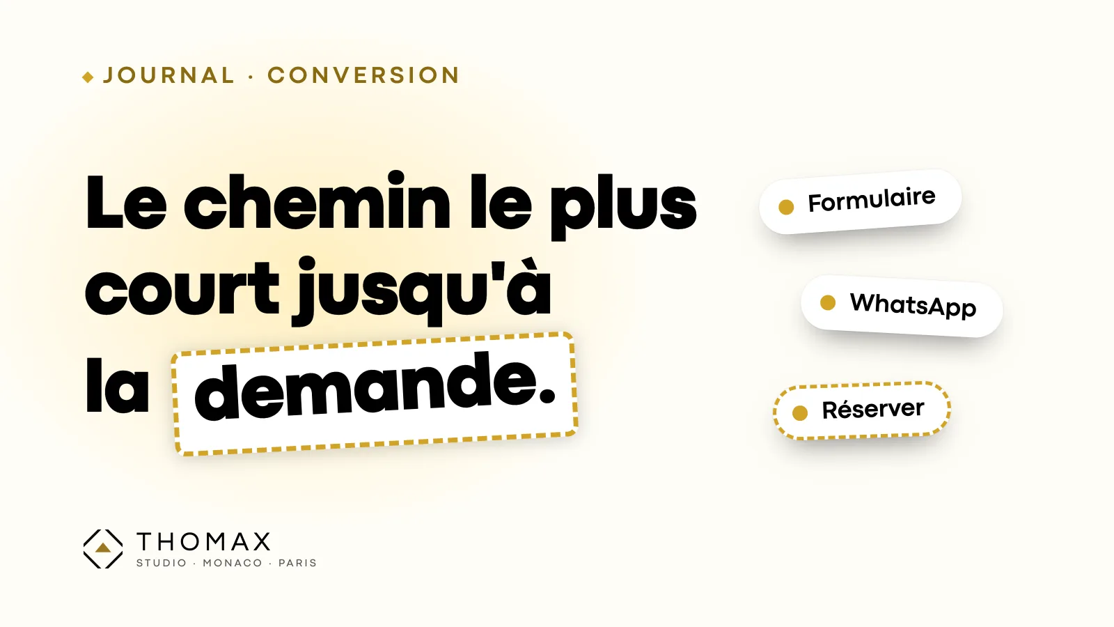
A showcase website does not sell online. It generates an enquiry: a booking, an appointment, a first contact. Everything else — the photos, the copy, the story of the house — serves that moment. And it is often the least worked-on moment of the site.
For a hotel, a concierge service or a gallery, visitors arrive with a precise intention and little patience for detours. Here is how to build the path that gets them there.
One main action per page
Every page has to know what it is asking for. A room: book. A concierge service: describe your request. An artwork: ask for details or a private viewing. When a page offers four buttons of equal weight, it offers none.
That main action must be visible without scrolling, on mobile as on desktop, and phrased around the expected result: “Check availability” rather than “Learn more”.
The form: short, and clear about what happens next
A contact form is not a qualification questionnaire. Ask for what lets you reply usefully, nothing more: a name, a way to reach the person, the request. The dates, if you are a hotel. The rest can be asked in your reply.
Below the button, one sentence makes a big difference: who replies, and when. “Reply within 24 hours, from our concierge team” reassures far more than a plain “Send”. And the confirmation screen must say clearly that the request has gone through.
WhatsApp and phone: for those who would rather talk
Part of a high-end clientele prefers a conversation to a form, especially internationally. A tap-to-call number on mobile and a direct WhatsApp link meet that need. Two precautions: show the hours when someone answers, and only promise an immediate reply if it really is immediate.
On mobile, a floating bubble is handy, as long as it does not cover a button or a form field.
Online booking: useful, as long as it does not take guests elsewhere
For a hotel, a restaurant or an appointment-based service, direct booking saves a back-and-forth. The point to watch is the booking engine itself: many open on another domain, with different typography, sometimes in another language. At the very moment of committing, visitors feel they have left the house.
When the tool allows it, embed it in your pages, in your brand's colours, and keep a human contact visible for those who have a question before booking.
Proof, in the right place
Before writing to a house they do not know, visitors look for reassurance: reviews, references, a real address, legal notices. Place these elements near the main action — below the form, next to the booking button — where doubt arises.
Checking your own path
The most useful test takes ten minutes: on your phone, start from the home page and make a real enquiry. Count the screens, note every hesitation, then check that the request actually arrives, and who receives it.
For an outside view, our audit page runs a free analysis of your site in a few seconds, including the path to an enquiry: form, tap-to-call number, WhatsApp, booking.