Digital accessibility spent years filed under technical detail, handled at the end of a project if the budget allowed. That era is over. Since 28 June 2025 theEuropean Accessibility Act (EAA) has imposed an obligation of result on a growing share of European commercial websites. In France the RGAA (Référentiel Général d’Amélioration de l’Accessibilité) provides the operational framework. And contrary to a stubborn belief, luxury and premium brands are not an exception.
The 2025/2026 regulatory frame, without the jargon
Two texts structure the obligation. In France the RGAA rests on the WCAG level AA criteria and already required accessibility of public services and large companies (turnover above €250m). The European Accessibility Act widens that scope considerably.
Since June 2025 it covers anyone offering the public digital products and services : e-commerce sites, online banking, ticketing, transport, telecoms, e-books. Micro-enterprises — fewer than ten staff and under €2m turnover — are exempt for services, but the general rule is plain: if you sell online in Europe, it probably applies to you.
The penalty is not only a fine. It is reputational exposure, the risk of formal notice, and a ranking risk — Google treats badly structured sites badly.
Why luxury brands wrongly believe they are exempt
The reflex is understandable. A luxury house sells an experience, an imagination, an exclusivity. Accessibility wrongly evokes municipal design, garish contrast and oversized buttons. The assumption follows that a high-end clientele is untouched by disability.
That is wrong twice over. First on the facts: close to 20% of the population lives with some form of disability — visual, motor, cognitive, auditory — and that includes a significant share of wealthy, ageing clients, precisely the heart of the luxury market. Presbyopia, declining contrast sensitivity, reduced fine motor control: these are the realities of senior premium customers with high purchasing power.
Second on strategy: accessibility imposes no ugliness. Apple, whose aesthetic standards are rarely questioned, is also a world reference in accessibility. The two do not conflict. Believing otherwise confuses accessibility with an absence of refinement.
The hidden commercial benefits
Beyond compliance, accessibility is an investment with several returns.
- Search. The fundamentals of accessibility — semantic structure with a proper heading hierarchy and landmarks, text alternatives, explicit labels — are exactly what search engines read to understand a page. An accessible site is better understood by Google, and now better interpreted by AI engines.
- Conversion. Smooth keyboard navigation, comfortable tap targets, clear forms: these are usability gains for every user, not only those with a disability. Less friction means more completed baskets.
- Brand image. Inclusivity has become a marker of a responsible brand. For luxury it signals care and attention to detail — the signature of the sector itself.
- Reduced legal exposure. Getting ahead of compliance costs a fraction of a formal notice or an audit imposed at short notice.
The checklist of fundamentals
There is no need to aim for perfect compliance on day one. Six fundamentals cover most of the risk and most of the value.
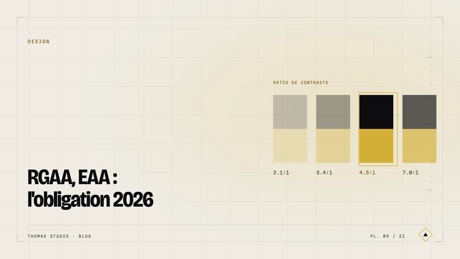
- Contrast. A minimum ratio of 4.5:1 for body text, 3:1 for large text. That elegant light grey on white is often out of bounds — and it can be corrected without betraying the identity.
- Keyboard navigation. Anything possible with a mouse must be possible with the keyboard alone. Test it by moving through the site with the Tab key.
- Text alternatives. Every meaningful image gets a relevant
altattribute; decorative images get an emptyaltone. - Semantic structure. A single
h1, a logical heading hierarchy, and landmarks (header,nav,main,footer) used correctly. - Visible focus. The element focused by the keyboard must be clearly marked. Removing the focus outline “because it is ugly” is a common fault, easily avoided with a well-drawn focus ring.
- Target sizes. Clickable areas are at least 24×24 px — ideally 44×44 on mobile — with enough space between them.
Building in accessibility without sacrificing premium design
The key is to treat accessibility as a design constraint, not a patch. Built into the design system from the start — colour choices, type scale, interactive states, components — it becomes invisible. It only degrades the result when bolted on at the end, because then you are improvising fixes.
In practice: define a palette whose contrasts are validated up front, design focus rings that belong to the aesthetic — a fine gold line rather than a system blue outline — and size components with comfortable margins. None of these decisions caps aesthetic ambition. The most demanding houses on the market prove it.
Accessibility done well does not dilute luxury: it confirms it. A site that works for everyone, on every device, with unbroken elegance, is precisely what a premium brand promises. Regulatory compliance is only the threshold. The real opportunity is to make accessibility an argument for quality, not a box to tick.